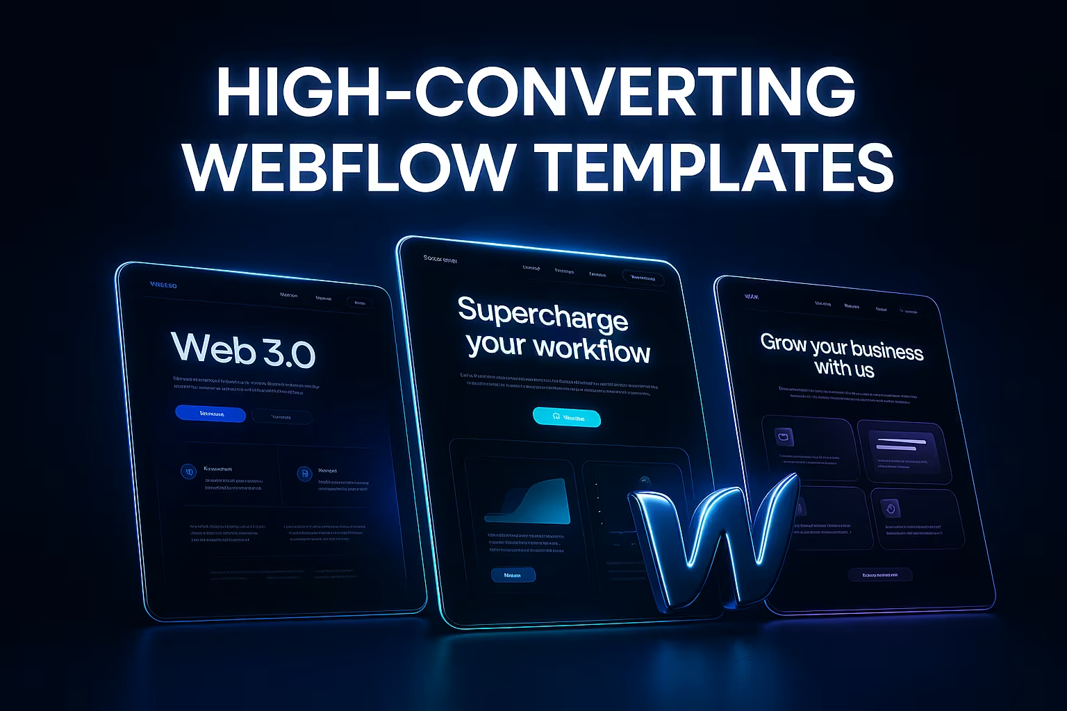
Create stunning websites fast, access 20+ templates
Start building your dream website today no coding needed.
Get in Touch
© 2026 Geniusflow, Inc. All rights reserved
I want to start with a simple story of design webflow templates — a real one. A few months ago, a founder came to me with a problem I’ve seen far too often. He had a beautiful website, full of advanced animations and “premium” visuals… but users weren’t signing up. Traffic was fine. Conversions? Terrible.
His words: “It looks amazing, but nobody knows what we do.”
That moment was the spark behind one of our recent GeniusFlow template upgrades. And honestly, it reminded me why UX should lead the design — not the other way around.
I’ll call him Sam. He runs a SaaS productivity tool. Smart guy, clean brand, great product… but users couldn’t figure out the core value within the first 10 seconds of landing on his site.
So we did a quick UX review — something like a “UX ER room” session.
We tested the hero section with five users. All five asked the same question:
“So… what does this tool actually do?”
The hero had a pretty layout, but the headline was vague and the visual didn’t show the product in action. Classic UX mistake.
We rebuilt the hero using the framework we use in all GeniusFlow templates:
After publishing the new version, Sam emailed me saying his homepage felt “like a real product site now.” The best part? His conversions doubled in one week.
That’s why we bake this UX rule into every GeniusFlow template. Not because it looks clean — but because it works.
Another founder we worked with, Maya, had a great website… except nobody clicked anything. Bounce rate was high. Users felt lost.
Maya’s nav had eight items. Five were dropdowns. The first-time experience felt like a small maze.
We applied a UX principle we use heavily in GeniusFlow webflow templates: limit top-level decisions.
Nothing more.
After she switched to the cleaner structure, bounce rate dropped 23% in two weeks.
I’ll keep this one short, but it matters. A startup team used a template from another marketplace — stunning on desktop, broken on mobile. Buttons overlapped. Text wrapped everywhere. Spacing felt random.
This happens when templates look nice in desktop Figma files but don’t survive real-world content.
This is why every GeniusFlow template includes:
Mobile conversions went up immediately for that founder. They said it “finally feels like something real.”
Now that you’ve seen some real cases, here are a few of the UX principles we’ve turned into standard building blocks inside every GeniusFlow template.
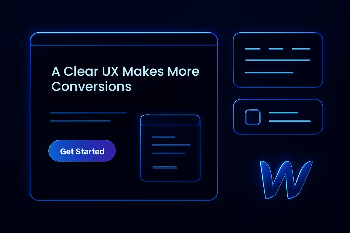
People trust what they can see. So our webflow templates always include:
We design sections in the exact order most users think:
This structure improves conversion far more than fancy visuals.
No bouncing, sliding, shaking madness.
Our interactions do one thing: guide your eyes.
Founder editing at 10pm? Marketing team replacing copy last minute? Product team swapping images?
The layout shouldn’t fall apart.
This is why our templates include:
One founder told me this after switching to a GeniusFlow template:
“I edited half my homepage on a Sunday morning… and nothing broke.”
I laughed, but it’s true — that’s the real goal. Templates aren’t just design. They’re guardrails. A good template doesn’t fight you. It protects you.
Great Webflow templates don’t start with pretty graphics. They start with UX — with real user behavior, real pain points, and real stories like the ones above.
If a webflow template can pass these UX tests, conversions take care of themselves.
And that’s what GeniusFlow is built on — templates shaped by real UX problems, solved through real design decisions, made for real founders trying to build something meaningful.