Create stunning websites fast, access 20+ templates
Start building your dream website today no coding needed.
Get in Touch
© 2026 Geniusflow, Inc. All rights reserved
I’ve lost count of how many times I’ve opened a brand-new Webflow template thinking, “This’ll be quick — just a few edits.” And then three hours later, I’m knee-deep in style overrides, random class names, and wondering why the hero section suddenly shifted three pixels to the left.
If that sounds familiar, welcome to the club.
Webflow templates are incredible starting points — they save weeks of design and build time. But customizing them efficiently (and keeping them maintainable) takes more than just swapping text and colors. After working on dozens of real projects for clients and templates under wpOcean, I’ve found a few practical habits that make the process way faster — and far less frustrating. Here’s what’s actually worked for me.
Here’s the mistake I used to make: I’d jump straight into changing layouts, renaming stuff, adding new sections… and suddenly the whole thing felt off. Turns out, every Webflow template has its own “logic” — a design system, spacing rhythm, naming structure.
Before touching anything, spend 10–15 minutes clicking through the Designer. Look at how classes are structured, how global colors are set up, how typography scales across breakpoints. Most good templates (especially premium ones) use a consistent system — something like BEM, Client-First, or a custom naming convention.
If you take a moment to understand that system, you’ll make cleaner edits and save yourself from future chaos. I once ignored this and ended up rebuilding half the homepage because I couldn’t untangle nested combo classes. Never again.
Pro tip: Open the Style Guide page if the template has one — that’s your blueprint for how everything was built.
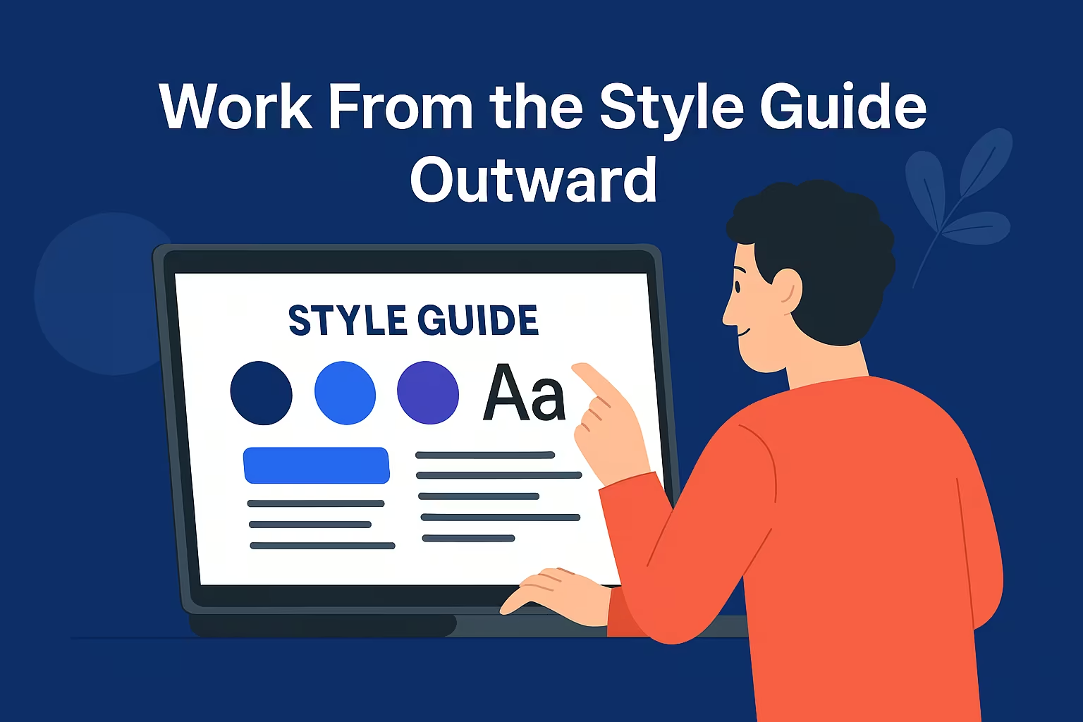
This is one of those “obvious but nobody does it” tips. Instead of editing sections on random pages, start by customizing the Style Guide — colors, fonts, buttons, spacing, and link styles. Why? Because those global changes cascade everywhere. You’ll instantly see your branding applied site-wide, which keeps everything consistent and saves a ton of time.
When I customize templates for clients, I always lock in the visual identity first — brand palette, typography, button states — right in the Style Guide. Then, when I start editing pages, 80% of the design is already aligned. It’s like setting the mood lighting before the guests arrive. Everything just fits better.
Here’s the thing — Webflow templates are loaded with pre-built sections. Most of the time, you don’t need to reinvent anything. If you like the hero section from Page A and the pricing section from Page B, just duplicate those into your new layout.
But — and this is key — don’t copy-paste wildly. Use Symbols (now Components) for shared sections like headers, footers, or CTAs. And when you do duplicate a section, rename and organize it logically in your Navigator. I usually create a “_Sections” folder and drop all reusable blocks there. That way, when I’m designing new pages later, I can just drag and drop the pieces I need.
Real-world example: For one SaaS site, I built the entire homepage in under an hour just by remixing sections from three different template pages — no custom code, no new classes. Just smart reuse.
If you’re not using Global Classes (like .max-width, .padding-section, .text-center), you’re working too hard. Most high-quality templates are built with a set of utility classes. Learn them. They let you adjust layout, spacing, and alignment without creating new custom classes every two minutes.
For example, I often just stack .flex, .justify-between, .gap-2rem — done. Layout fixed in seconds. This approach also keeps your project lightweight. The more custom classes you create, the heavier and more confusing your build becomes. I’ve seen designers with 400+ unique classes for a five-page site — and trust me, nobody wants to maintain that.
So before creating a new class, ask yourself: Can I reuse an existing one? Nine times out of ten, you can.
This one’s a classic mistake — and yes, I’ve made it plenty. You design a stunning desktop layout, everything looks perfect, and then… you check mobile. Suddenly the buttons overlap, text breaks weirdly, and your hero image looks like it’s been through a blender.
Here’s what I do now: after customizing each section, I immediately check it on tablet and mobile. Not later. Right then. It might feel slower at first, but it’s actually faster overall. You fix small layout quirks as you go, instead of facing a giant responsive nightmare at the end.
Plus, when you fix responsiveness section-by-section, you start learning how the original template’s breakpoints are structured. That helps you make smarter design choices later.
Pro tip: Use Webflow’s preview shortcuts (like Shift + Command + E on Mac) to toggle devices quickly — it’s a tiny habit that saves hours.
This isn’t official Webflow doctrine, but it’s saved me countless headaches. I always create a hidden page called “Playground” in every project. It’s where I test new components, experiment with colors, or tweak animations without messing up the live pages. Once it’s polished, I just copy it over. It keeps my working space clean and my sanity intact.
Honestly, these are habits that only clicked after building a lot of real Webflow sites. It’s easy to underestimate how much time you lose when you skip these basics — I sure did in my early days. But once you get in the rhythm, customizing templates feels less like a chore and more like remixing a great track. You’re not rebuilding the song — you’re just making it sound like you.
Webflow templates are meant to speed up your workflow, not slow it down. The real magic isn’t in flashy animations or new layouts — it’s in how fast and confidently you can make them your own.
If you treat templates like frameworks (not finished products), you’ll unlock a level of creative efficiency that honestly feels addictive. I’ve seen freelancers triple their project output just by getting good at this part. And once you’ve done it a few times, you’ll start seeing templates not as shortcuts — but as launchpads.
